GB Chiropractic identity design 2
Introduction
Based on our discussions so far, I’ve explored a range of ideas for the identity design, discarded any ideas which definitely aren’t suitable, and I’ve created mockups of the most suitable ideas which I’ve displayed on this page.
Some of these designs could be used without any further modification, others are more rough and would need some refinement, but they’re all potential directions for further development.
Please let me know if any of these ideas appeal to you, or if you’d like to see any modifications or variations – I look forward to getting some feedback from you.
I’ve presented all of the images on this page in black and white so that we can focus on the shapes without the colours affecting our judgement – let’s work on the colour scheme during the next stage of development.
When considering the ideas shown below, it might be useful to ask yourself the following questions:
- Would this design appeal to my target market?
- Would this design represent the spirit and values of the GB Chiropractic brand?
- Would this design help GB Chiropractic to stand out from the competition?
- Would this design ensure that the GB Chiropractic branding looks fresh for the foreseeable future?
I hope that you like one or more of the ideas shown below and would like to develop it into the final design.
Typeface Shortlist & Cases
Here are 6 of the typefaces from the original shortlist that I think would be the most suitable for use with the design ideas further down the page. Where possible I’ve used lowercase Avenir when creating the example images further down the page.
The best approach will probably be to use either all-uppercase (‘GB CHIROPRACTIC’) or all-lowercase (‘gb chiropractic’) lettering. Alternatively we could consider using a combination of uppercase and title case (‘GB Chiropractic’).
A wordmark which featured a mixture of upper and lower cases (i.e. ‘GB chiropractic’ or ‘gb CHIROPRACTIC’) would be relatively inelegant, I think.
We could also consider visually separating the ‘G’ and ‘B’ (e.g. ‘G B CHIROPRACTIC’ rather than ‘GB CHIROPRACTIC’) within the wordmark design, which would reduce the emphasis of ‘this is a British company’ and shift the emphasis onto ‘CHIROPRACTIC’ instead. Another advantage of that approach is that a 3-letter symbol version (‘G B C’) of the full wordmark could be created, in which the 3 letters have equal emphasis and the design is relatively symmetrical.
Avenir Light
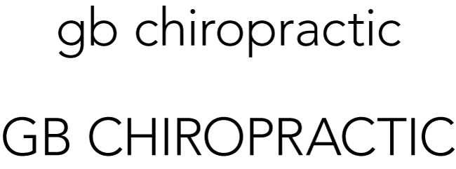
Blair Light

DIN Pro Regular

Engravers Gothic

Gotham Book

Montserrat Light
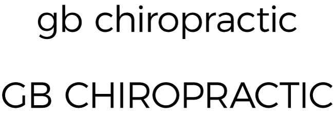
Simple Wordmark Using Unmodified Letter Shapes
A simple wordmark logo could be created using unmodified letter shapes with no additional graphic elements. The examples below feature lowercase Avenir lettering.
‘GB’/’gb’ and ‘CHIROPRACTIC’/’chiropractic’ could be visually separated in one of the following ways:
‘gb’ and ‘chiropractic’ could be visually separated by weight, with ‘gb’ relatively bold:

‘gb’ and ‘chiropractic’ could be visually separated by weight, with ‘chiropractic’ relatively bold:

‘gb’ and ‘chiropractic’ could be visually separated using two different colours:

‘gb’ and ‘chiropractic’ could be visually separated using a space:

‘gb’ and ‘chiropractic’ could not be visually separated at all, and the resulting wordmark would still be clearly legible as ‘gb chiropractic’, with some nice symmetry between the ‘b’ and the ‘ch’:

Graphic Symbol Idea
A combination logo could be created featuring a graphic symbol combined with a simple wordmark, where the graphic symbol can also be used separately as a branding device.
However as we’ve discussed, it’s difficult to come up with a concept for a meaningful symbol that hasn’t already been badly executed in countless chiropractic logos.
A combination logo featuring a graphic symbol is probably not going to be the best solution.
However, just for comparison, here’s an idea for a graphic symbol, and an associated combination logo, featuring repetitions of a vertebra illustration, forming a flower/mandala-like symbol. I’ve used a stock illustration for demonstration purposes, rather than custom-drawing the vertebra. A flower could represent growth, nature, wellbeing, etc.
Flower/mandala-like symbol based on repeated vertebra illustration
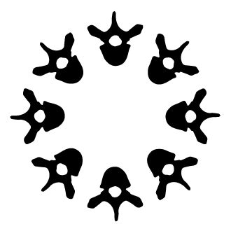
Combination logo example featuring Gotham Book lettering

Wordmark Logo Ideas
The best approach will probably be to create a wordmark logo, rather than a combination logo with a graphic symbol. Its design can be inspired by the concept of a spine, but in an abstract way rather than literally depicting a spine.
Just as the spine, and the whole human body, are comprised of separate parts but are more than the sum of those parts, a wordmark logo could be comprised of separate elements that form part of the whole wordmark.
Ideally a wordmark design would also be flexible and versatile, so that it can be modified for use in different contexts. For example, a ‘g b chiropractic’ wordmark could be shortened to create a ‘g b c’ monogram symbol which fits neatly into a square or circular area, and which can therefore be used as an online profile image, or elsewhere as a branding device.
Here are some ideas for wordmark logos, in no particular order.
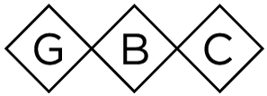
G, B and CHIROPRACTIC framed with 45o-angled outlines
This idea works better with uppercase than lowercase lettering. The example below uses Gotham Book lettering.
With the G and B framed separately, the 3 resulting elements could represent either the 3 main regions of the spine, or they could represent the coccyx, sacrum and main spine.

This approach would allow us to create a ‘G B C’ symbol version of the wordmark:
G, B and CHIROPRACTIC framed with circular/rounded outlines
As above, but with circular/rounded frames:

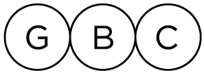
Wordmark with a channel running through it
A horizontal channel could be cut out of a wordmark, representing a spine running through the core of the wordmark.
This idea works best with uppercase lettering. Here’s a relatively rough mockup using Gotham lettering:

This approach would also allow us to create a ‘G B C’ symbol version of the wordmark, which I have not shown.
Bordered wordmark representing a spine
A wordmark could have upper and lower borders, so that the overall wordmark represents a spine.
‘g b chiropractic’ would then be at the core/centre of the wordmark, which could represent GB Chiropractic’s position at the core/centre of the local community.
Here’s a mockup using lowercase Avenir lettering:

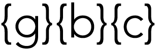
Curly brackets separating the elements
The letters in the wordmark could be separated by and framed with brackets to form a series of elements which could represent the regions of a spine.
With the ‘g’ and ‘b’ framed separately, the 3 resulting elements could represent either the 3 main regions of the spine, or they could represent the coccyx, sacrum and main spine.
The examples below feature lowercase Avenir lettering.
With ‘gb’ grouped together:

With ‘g’ and ‘b’ separated:

This approach would allow us to create a ‘g b c’ symbol version of the wordmark:
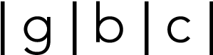
Vertical lines separating the elements
As above, but using vertical lines instead of curly brackets. The examples below feature lowercase Avenir lettering.
With ‘gb’ grouped together:

With ‘g’ and ‘b’ separated:

This approach would allow us to create a ‘g b c’ symbol version of the wordmark:
Tabbed letters
Each letter in the wordmark could have a ‘tab’ on its left edge so that the letters resemble a series of connected vertebrae, or separate parts of a greater whole.
This idea only works with uppercase lettering.
Here’s a relatively rough mockup of this idea, using uppercase Gotham lettering:

Discarded Ideas
I’ve discarded the following ideas as I don’t think that they would be suitable, but if you’d like me to explore any of them further then please let me know.
- reflection of the initials ‘GBC’ to make a symmetrical symbol
- 4 repetitions of a vertebra shape, forming a plus symbol that’s associated with healthcare
- a monogram symbol featuring the letters ‘GBC’ interlocking like vertebrae
- a graphic symbol featuring repetitions of a spine illustration, forming a flower/mandala-like symbol
- a graphic symbol featuring a spine-shape element, an idea which has been badly executed in countless chiropractic logos
- monogram symbols in general, unless they can be formed from a flexible wordmark as shown above
- a wordmark in which each individual letter is framed in some way (e.g. so that the individual letters could represent separate vertebrae), which would be too wide to be versatile in use
Colour Scheme
Let’s work on the colour scheme during the next phase of development.